Canvas vs. Metal vs. Acrylic Prints — Which Wall Art Style Fits You?
When you walk into a room and see a piece of art that just works, it’s rarely an accident. The colors, the frame, the lighting — those details matter. But so does something people rarely think about: the material the artwork is printed on.
Canvas, metal, and acrylic prints each tell a different story. They play with light, texture, and reflection in ways that can make the same image feel completely new. Choosing the right medium is one of the most subtle — and powerful — tools a designer has for shaping atmosphere.
.png)
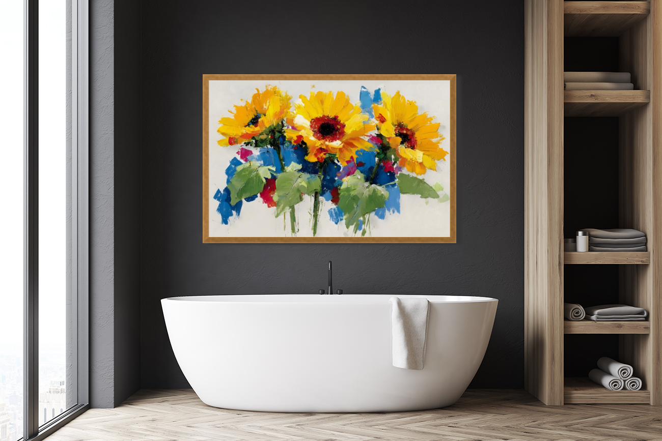
Canvas Prints: The Warm Classic
If art had a universal language, it might be canvas. It’s the material that carries centuries of creative history — familiar, forgiving, and soft under light.
Canvas prints are perfect for homes that crave warmth and texture. They diffuse light rather than reflect it, giving the image a tactile, painterly feel that invites closeness. The matte finish hides minor imperfections in walls or lighting, which is one reason designers love them for cozy spaces.
A large canvas above a linen sofa or over a bed creates what designers call visual serenity — proportionate scale, muted surface, and natural fibers all working together.
When you browse collections like Contemporary Neutrals or Coastal Calm at Savage Art Prints, you’ll notice how these pieces often feel handcrafted even when produced with high-definition giclée printing. That’s the charm of canvas: timeless without being predictable.
Metal Prints: The Modern Statement
Metal prints are the opposite of understated — they thrive on clarity, contrast, and sheen.
Printed directly onto aluminum panels, they produce deep blacks, vivid colors, and razor-sharp detail. Designers use them when they want energy in a room — a pop of modern confidence. In contemporary interiors, a metal print acts like jewelry: reflective, precise, and bold.
The effect changes dramatically with light. In bright rooms, metal reflects ambient daylight, giving the surface a living shimmer. Under spot lighting, it sharpens to gallery precision.
Metal prints suit bold photography, pop art, or mid-century abstracts. They also thrive in rooms with deliberate contrast — dark cabinetry, white walls, minimal décor — because that reflectivity becomes part of the design language.
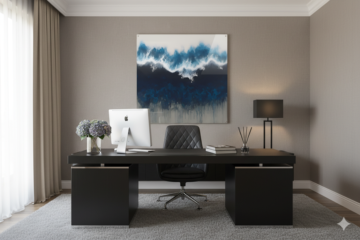
Acrylic Prints: The Luxury Finish
Acrylic prints are the most sculptural of the three — the choice when you want depth and drama. The image is printed onto the back of a clear acrylic sheet, which adds a sense of dimension and a subtle glass-like glow.
They’re luminous — colors look suspended in air, and blacks gain richness through the depth of the acrylic layer. The edges gleam when they catch light, which makes them feel expensive even before you look closely.
Interior designers use acrylic when a space calls for refinement: a minimalist apartment, a gallery-style hallway, a crisp modern office.
Mixing Materials Like a Designer
You don’t have to choose one medium and commit forever. A well-designed home might feature:
- a large canvas in the living room for warmth
- a single metallic print in a hallway for energy
- an acrylic centerpiece in the entryway for refinement
The contrast between materials keeps the space dynamic — just keep one connecting thread (color palette, subject, or tone) so everything feels intentional.
Matching Medium to Mood
- Canvas → Serenity (texture, linen, warmth)
- Metal → Movement (boldness, contrast, modern edge)
- Acrylic → Clarity (polish, precision, luxury)
A medium isn’t just a finish; it’s a feeling. The right one makes your art — and your home — resonate.