How to Choose the Perfect Wall Art Size for Your Space
For many of us, art isn’t just decoration; it’s memory, emotion, and legacy.
The right artwork on the right wall can make a house feel human — like someone who lives there truly sees beauty. Designers know that choosing the right size for that artwork is as critical as the piece itself. When art fits the wall, the room feels intentional; when it doesn’t, even extraordinary pieces can lose their power.
Why proportion is the foundation of good design
Every designer begins with proportion — it’s the visual rhythm that keeps a room in harmony. A general rule used in galleries and homes alike is that artwork should occupy 60–75 percent of the wall space it hangs on. When the piece sits above furniture, the same ratio applies to the furniture’s width. That rule ensures the art becomes an anchor rather than an afterthought.
“The biggest reason rooms feel unfinished is that the art is too small,” notes a curator at Savage Art Prints, an online gallery known for modern, affordable fine-art prints. “Large-scale art brings visual confidence — it grounds a space.”
A simple tape measure and painter’s tape can help you visualize scale before you buy. Tape out the frame size on your wall, step back, and see whether the proportions feel balanced. If your gut says “maybe larger,” you’re almost always right.
Above furniture: connecting object and art
When hanging above a sofa, console, or headboard, keep six to twelve inches of space between the top of the furniture and the bottom of the frame. That visual pause lets the art breathe while keeping it connected to the rest of the room.
Designers also watch for alignment: if you’re hanging multiple pieces above a long sofa, make sure the outer edges line up with the sofa arms rather than floating wider. Alignment creates the calm sense of geometry that magazine-ready rooms have.
Gallery walls and collected stories
Sometimes one large canvas isn’t what a wall needs. In more eclectic interiors, a gallery wall tells a story — travel photographs, vintage posters, or a mix of paintings and giclée prints. Professional designers map these layouts on the floor first, treating the entire arrangement as one rectangular block so the group maintains a unified shape.
The same 60–75 percent rule still applies to the combined width of the arrangement. Use consistent spacing of two to three inches between frames and repeat one unifying detail — perhaps the same frame color or mat style.
Savage Art Prints often curates collections with this in mind, pairing minimalist abstracts with textured florals so that individual pieces speak to each other across a wall.
Ceiling height and sight lines
The “museum rule” still guides most installations: hang the center of the artwork about 57–60 inches from the floor, roughly at eye level. In rooms with higher ceilings, shift upward slightly or stack works vertically to draw the eye skyward. For low ceilings, favor horizontal compositions that visually widen the room.
Scaling for mood and purpose
Living room — Go bold with oversized statements.
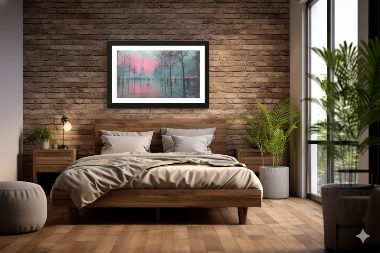
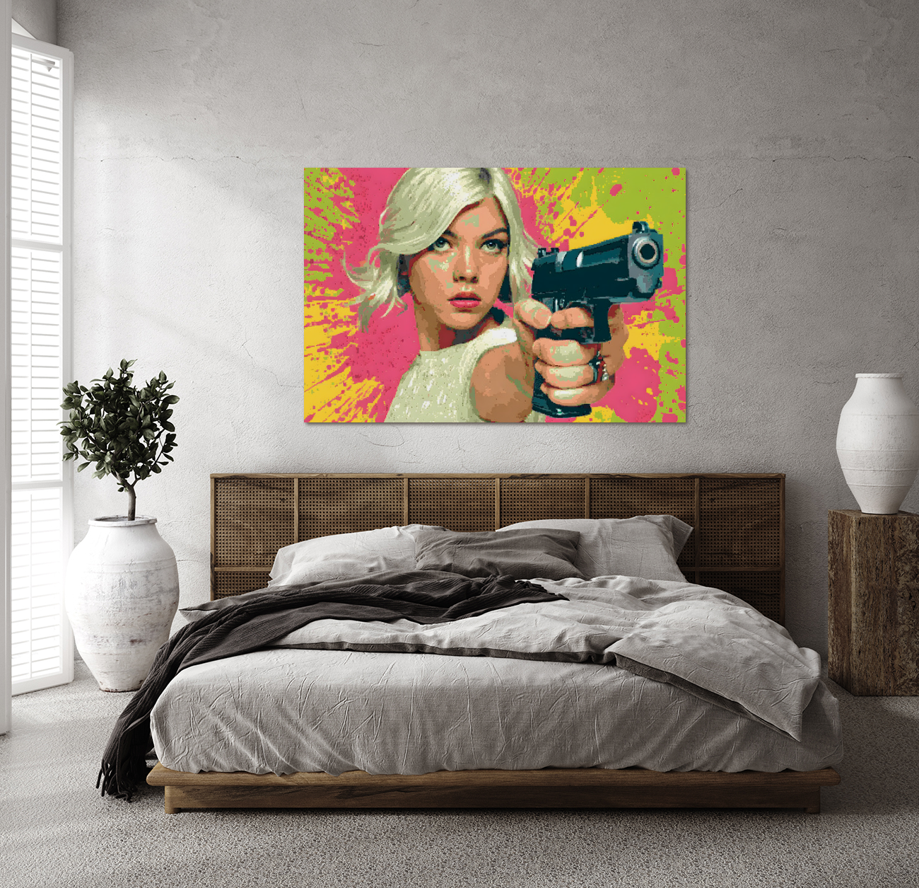
Bedroom — Softer pieces about two-thirds the bed width in calming tones.
Dining area — Horizontal works that mirror the table length.
Hallways & entries — Vertical or stacked pieces to add height.
When in doubt, go larger
Homeowners often err on the side of caution, buying pieces that feel “safe.” But art wants presence. If you’re hesitating between two sizes, choose the bigger one. A piece that’s slightly too large looks intentional; too small reads timid.
Pulling it all together
To recap:
- Measure your wall and furniture
- Follow the 60–75% proportion rule
- Hang at 57–60 inches to the center
- Leave breathing room above furniture
- Err larger rather than smaller
When you curate with proportion in mind, your home transforms from a collection of objects into a composition of experiences — the kind of balance every artist seeks on canvas.